
Is Your Website A Virtual Scavenger Hunt?
Michael Grossman • March 12, 2026
Most cleantech websites aren’t broken. They’re just confusing.
While some companies opt for space-age design with bells and whistles, others take the minimalist route. Pre-seed stage companies sometimes have just a homepage placeholder, while other companies further along the technology track pack their websites with subpages for every market, technology, and use case the company serves.
And yet, both of these design types share a common flaw. Their audience leaves without understanding one simple thing:
Is this company for me?
If your website forces visitors to hunt for relevance, you’re not educating them. You’re exhausting them. And in cleantech, where your company is competing for attention with hundreds of other worthwhile ideas and credentialed teams, that friction quietly kills momentum.
You Have 60–90 Seconds. That’s It.
The average website visitor does not explore your site. They scan it.
Research from Nielsen Norman Group on user behavior and web scanning (https://www.nngroup.com/articles/how-users-read-on-the-web/) shows that users typically spend less than 90 seconds deciding whether a website is relevant to them. Most never scroll past the first screen.
Fewer still click into subpages.
That means your homepage isn’t an introduction. It’s a filter.
Visitors arrive with one question in mind:
“Is this for someone like me?”
If the answer isn’t obvious immediately, they leave.
Chasing Markets With Website Subpages
Does your website have dropdown menus with:
• Solutions for Utilities
• Solutions for Municipalities
• Solutions for Agriculture
• Solutions for Industrial Users
• Solutions for Developers
• Solutions for Partners
On paper, this looks thorough. In practice, it creates a problem.
Visitors don’t want to navigate. They want to recognize themselves immediately.
When relevance is buried behind multiple clicks, you’ve turned your website into a scavenger hunt. And most people won’t play.
According to Google’s research on decision-making and cognitive load, every additional choice or step increases friction and dramatically reduces engagement.
In other words:
The more your website asks visitors to figure things out, the less likely they are to stay.
People Don’t Browse Websites.
Here’s the core misunderstanding:
Your website is not a product catalog.
It’s not a technical library.
It’s not an internal org chart translated into web pages.
It’s a recognition tool, and the best ones only try to answer a single question before you ask them to take the next step—engage with you.
You want them to feel seen immediately and share their contact information to start building trust.
If someone can’t tell within seconds:
- Who you help
- What problem do you solve?
- Whether you understand their world
They won’t click further.
This aligns with findings from the Nielsen Norman Group’s research on first impressions and credibility, which shows users form an opinion about relevance and trust almost instantly—and rarely revise it later.
Productizing Your Website Creates Distance
Another common mistake seen on cleantech websites is focusing on products and technology.
- Technology diagrams
- Product names
- Platform descriptions
- System architectures
- Feature lists
That might be appropriate after relevance is established. But when it comes first, it creates distance.
People don’t connect with products. They connect with problems.
When a homepage opens with “Our proprietary platform leverages advanced systems to optimize…” the visitor has no anchor. They don’t yet know why they should care.
This is especially risky in cleantech, where buyers may not fully understand the technology.
Your Homepage Should Clarify the Problem You Solve—and for Whom
The most effective cleantech homepages make it immediately obvious who the company is for.
Not what it does.
Not how it works.
But who does it serve?
For example:
- “We help dairy operators turn waste into predictable revenue.”
- “We help utilities manage grid instability without costly infrastructure upgrades.”
- “We help industrial facilities reduce emissions while maintaining uptime.”
These statements create instant recognition. Once the visitor sees themselves, then they’re willing to learn how the solution works.
Recognition Comes Before Education
Many founders want their website to educate the market. That’s a good goal—but it’s the second step, not the first.
Recognition comes first.
Then comes education.
Then comes conversion.
Trying to educate before recognition is like explaining the solution before confirming the problem.
According to Microsoft’s research on attention and information processing (https://www.microsoft.com/en-us/research/publication/attention-spans/), modern digital users make rapid relevance judgments before committing attention. If the content doesn’t immediately align with their needs, they disengage.
Your homepage must earn the right to explain.
What Happens When Visitors Have to Hunt
When your site is structured like a scavenger hunt:
- Visitors don’t click deeper.
- They miss relevant subpages.
- They misunderstand your focus.
- They assume you’re not for them.
- They leave quietly
You don’t get feedback.
You don’t get objections.
You don’t get a chance to clarify.
You just lose attention.
And in cleantech, attention is expensive to earn and easy to lose.
The Homepage Is Not the Place to Be Everything to Everyone
Many cleantech founders resist narrowing their messaging because their technology has multiple applications, and they don’t want to limit their reach . The fear is that focusing on one audience will exclude others.
In reality, the opposite happens.
Clear messaging attracts more people because it signals confidence and understanding. Vague messaging repels everyone.
Your Website Is Not a Sales Deck
Another reason websites become scavenger hunts is that they are treated like sales decks.
Sales decks are designed to be presented.
Websites are designed to be scanned.
What works in a pitch meeting often fails online.
A successful website does three things:
- Addresses the problem the target market faces
- Answers why you understand their problem
- Secures the viewer’s contact information
Once the website has accomplished those priorities, there are secondary goals:
- Demonstrate a team that can execute the brand promise (solve the problem)
- Build confidence by showing traction with accelerators, investors, and early customers.
- Answer obvious questions quickly.
To be clear, anything that requires explanation in person doesn’t belong on a website because a website isn’t designed to answer every question. It’s a teaser to interest your audience in your solution.
How Clear Websites Actually Convert
Clear websites don’t convert because of clever copy. They convert because they remove doubt.
Visitors should leave your homepage knowing:
- “This company understands my problem.”
- “This feels credible.”
- “I know what to do next.”
That’s it.
According to Google’s UX research on high-performing landing pages , clarity and simplicity consistently outperform complexity in engagement and conversion metrics.
Clarity wins. Every time.
This Is Where Most Cleantech Websites Need a Story Refresh
If your website:
- Has dozens of subpages, but low engagement
- Looks professionally designed, but doesn’t convert
- Gets traffic but few inquiries.
- Confuses people about who you serve
- Leads with products instead of problems
You don’t need a redesign.
You need a story refresh.
A Website Story Refresh doesn’t change everything.
It changes the right things:
- Homepage narrative that can be grasped in seconds
- Visual and written problem-solution framing
- A professionalized team page to show that the solution can be executed.
- Third-party validation
- Prominent call to action
It ensures that visitors recognize themselves immediately.
What a Website Story Refresh Actually Does
- Clarifies who you serve, up front
- Reframes messaging around problems, not products
- Aligns language with buyer reality
- Guides visitors naturally with story framing
- Improves conversion so you can build a relationship during long sales cycles
Turn your website from a maze of uncertainty into a clear value proposition for your audience.
Final Thoughts
Your website isn’t failing because your company isn’t impressive. It’s failing because it’s asking too much of the visitor.
People don’t want to explore. They want to recognize.
If your homepage doesn’t clearly answer “Is this for me?” within seconds, you’re losing the very people you’re trying to attract.
Give your audience a Eureka! moment—right on the homepage.
Are climate tech founders spending wisely on conferences? Calculate conference ROI, determine which events are worth attending, and optimize your limited resources.
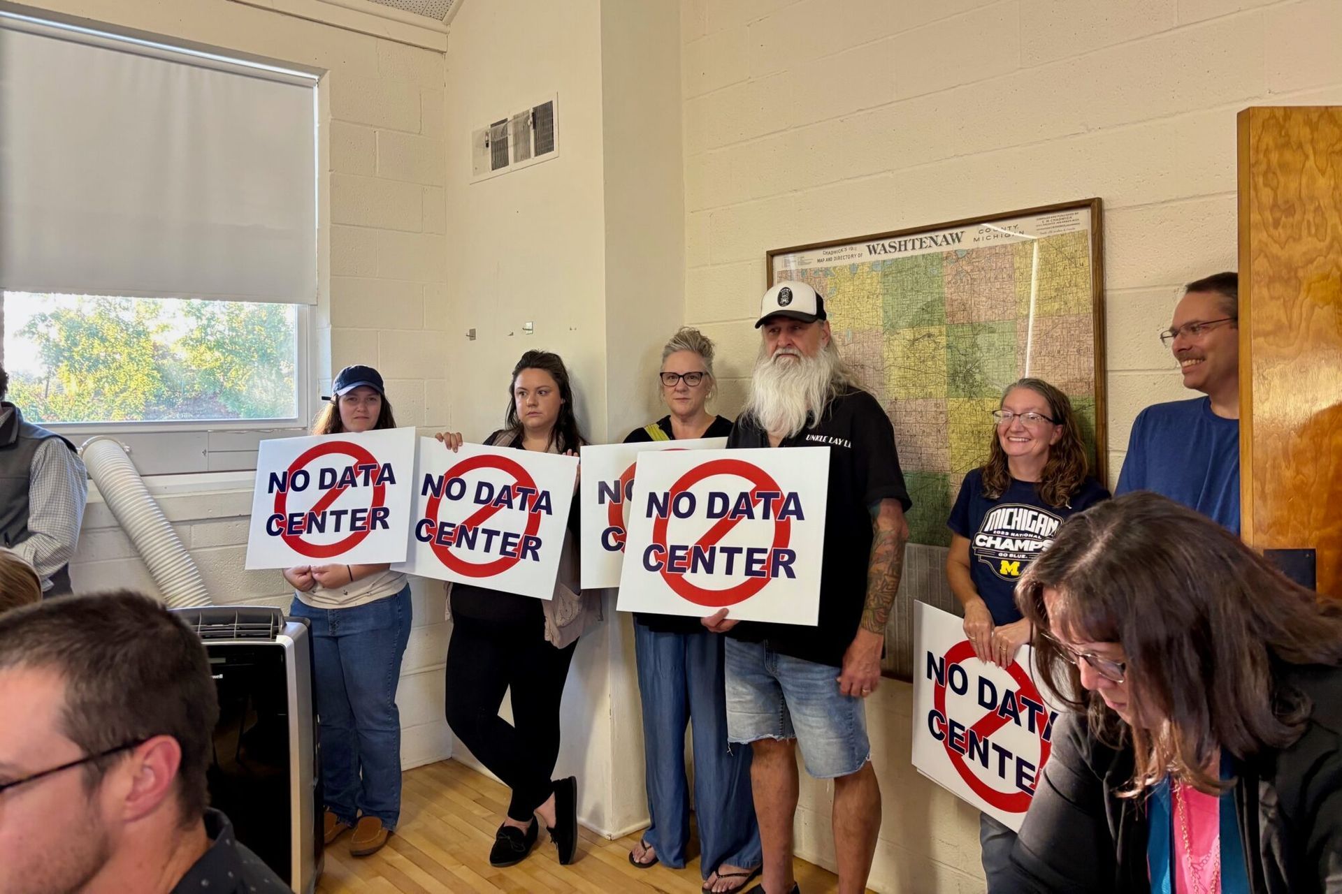
Why clean energy projects encounter community opposition before hearings begin, and how developers can shape local perception earlier.
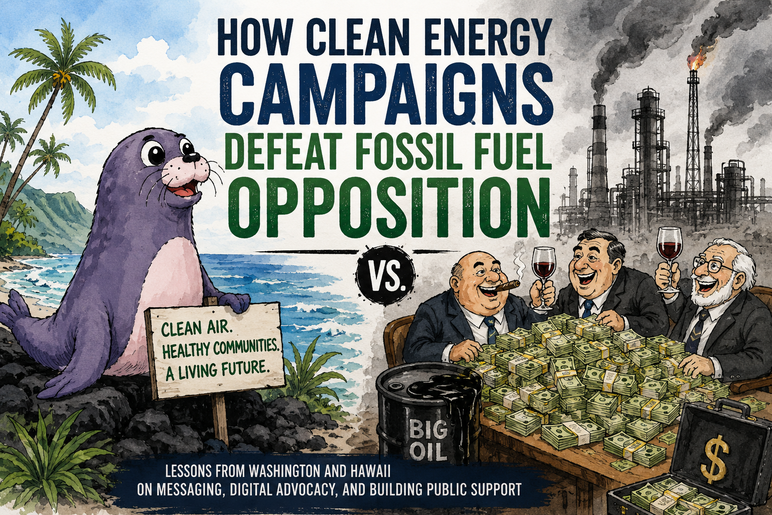
Lessons from Washington and Hawaii on messaging, digital advocacy, and building support against fossil fuel opposition.
A founder’s guide to Reddit for cleantech, climate tech, deep tech, water tech, and ag tech companies, including the best subreddits, post types, and search-friendly writing tactics.
What clean energy developers can learn from The Petroleum Papers about community opposition, fossil fuel front groups, permitting fights, and project approval strategy.
A practical guide for cleantech founders to test whether their message, website, pitch, and marketing systems are ready to support funding, pilots, and growth.

Everyone is hiring for “GTM,” but few define it clearly. Here’s what go-to-market actually means in cleantech, where it fits, and why it matters for revenue.
Scientists and engineers are trained for deep focus. Investors and customers skim screens. Here’s why cleantech founders lose attention—and how to make their technology easier to remember.
Your climate tech pitch is getting interest—but no second meeting. Here’s why investors and pilot partners aren’t moving forward, and how to build a message that makes the business case clear and drives real decisions.